Project Details
- Tools Used : Google Data Studio, R
- Live Dashboard : Google Data Studio
- Data : Google Sheets
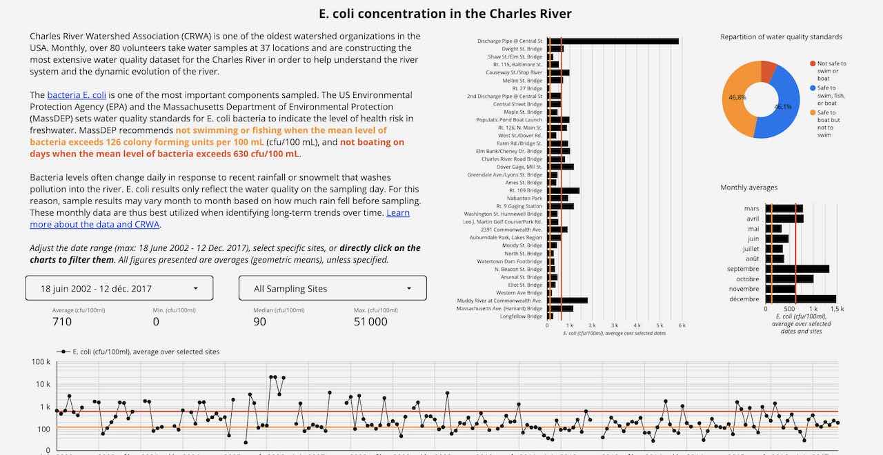
E. coli concentration in the Charles River
Google Data Studio is becoming more and more popular. It is particularly attractive to small organizations or nonprofits because it is free, easy to use, customizable to match your brand, and easy to link with live datasets in Google Sheets. Its disadvantages, on the other hand, are that it is optimized for the Google set of tools, the reports can only be read online and the choice of charts is limited. Such dashboards are embeddable in websites as “responsive” iframes, as below, but are not mobile-friendly.
The goal of this project was for me to test and demonstrate the capabilities of Google Data Studio. I used open data published by the nonprofit I collaborate with at Code for Boston: the Charles River Watershed Association. This dashboard offers the possibility for users to explore and understand data previously only visible in tabular and therefore abstract form.
The data is live: if someone or an ETL process updates the Google Sheet, the dashboard will be updated. You can click on any data point or bar to filter the charts. I personally find the date range filter offered by Google Data Studio not user friendly.
To conclude, one of the main advantages of such a tool is that after a consultation to define and calculate the most important KPIs, a first design, and short training, customers are fully able to maintain and further develop this product internally. No dependence on external contractors is necessary.