Project Details
- What I Did : Design, data viz
- Tools Used : R ggplot2, Affinity Designer
- Download Viz : Download as PDF
- Date : 7 Aug 2020
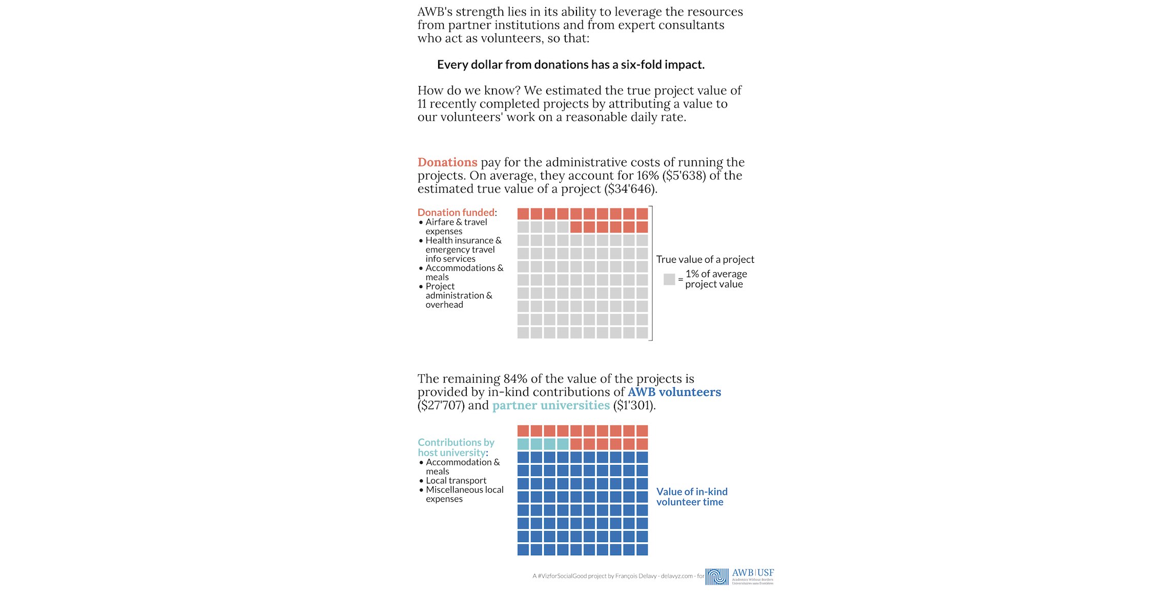
Illustration of the actual impact value of a donation
#VizforSocialGood helps mission-driven organizations to promote social good and understand their own data through beautiful and informative data visualization; visualizations made by volunteers, like me.
Academics Without Borders’ mission is to help developing countries improve their universities so that they can train their own experts and conduct research to assist in their countries’ development.
I decided to tackle one of the challenges proposed by AWB: Illustrate the actual impact value of a donation.
Problem Definition
In the words of AWB:
- In addition to its effectiveness, AWB’s impact is substantially augmented by the fact that we are financially very efficient - both because we minimize all admin costs and, most importantly, because the highest cost element of our operations is the time of our expert consultants who act as volunteers without remuneration.
- Paradoxically, this results in any proportional representation of our costs appearing to be very heavily weighted towards non-project/admin costs because the service we actually deliver to our partners is largely free - we pay only for direct costs such as airfare, accommodations, etc.
- We have attempted to illustrate this situation through visualization of what our costs would actually be if we paid for the services of our expert consultants.
- We have done this largely by attributing a value to our volunteers’ work on a project based on a reasonable daily rate. Using this estimate, we then looked in detail at the actual costs and time devoted by volunteers to 11 projects and calculated an average distribution of costs, including an estimate of the average value of the volunteers’ time.
- From this, we can estimate the actual impact of the donor’s donation as a multiplier, i.e., each dollar results in an impact of 6 times the value of the donation.
- We have developed two illustrations of this analysis: concentric circles (Annual Report 2018, p21) and bar graph (Annual Report 2019, p21).
- Is there a more effective way to visualize this?
Proposed Solution
What struck me most about the previous attempts at visualizing the impact of donations was that I could not easily grasp what was presented. Where are these $ coming from? Is this the same data as what is presented on the left Financials page? It is only through further research and reading that I could understand it.
My approach was thus to try to better explain to the reader what do these numbers mean and how they were obtained. For this, nothing fancy, I chose to write more text. This data storytelling combines data, visuals (a waffle chart shows the percentages of the average total project value), and a narrative. The visualization might be a bit more crowded, but I believe that it is clearer and thus more efficient in explaining to donators or readers the actual impact value of a donation.

The visualization is the size of half a ledger paper, taking the same space as the previous visualizations in the annual reports. The numbers are different than those of the two previous annual reports because they were updated by AWB with data from newly completed projects. Download as PDF